3D Animation and Serious Game VR as a marketing tool? Welcome at TP : protection electronic transformers.
I said that I do not want to focus my studio only on VR as everyone is already making VR and I don’t like to follow the crowd. Why should we do that, what value could we add to it? On the contrary, if the project is interesting and we are the best one to do it: we’ll be glad to dig deep into it! It was the case here: from our knowledge of gamify the teaching and a tight schedule, two skills that we have.
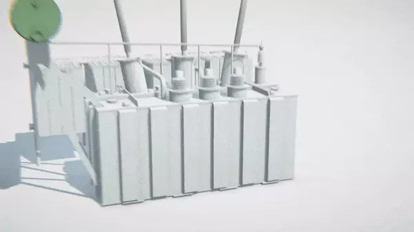
Our customer had only slides to show during fair, and a reduced model (very detailed but also very fragile) of the products that they sell. Obviously they can not do better as their product consist of protections for electronic transformers and those are gigantic pieces of hardware, some of them being more than 10 meters long by 6 meters high, not easy to bring on a booth!
VR, a relevant tool
VR is a natural solution to move freely around a gigantic object and watch it real size as if you are in front of the real one.
To be able to show it to everyone, even the one that feel motion sickness, and being able to show precisely the purpose of the protections, two animations are added to the project: one where the transformer is not protected and explode, and one where it is protected and we can see the whole process that triggers itself to ensure safety.
Experience
From our previous VR experiences, we knew that we have to suggest (or make that mandatory) moving using teleporation. With a black fading screen it also gives the impression that you blink your eyes and allow the brain to assume the new position with few trouble.
Another great aspect of VR is that you can use virtual limits in the landscape to create real limits when the user is moving. Indeed, as the player is immersed in a recognizable 3D world, s.he will naturally avoid moving through an object if s.he sees it. We modeled platforms with sides of approximately 2.5 meters, a size that allow the customer to put the experience in a booth, and compatible without any issue with the Oculus which was our choice here. When teleported, the user is always in the same 2.5 meters square, allowing movements in the real booth without hitting anything.
The platform have all metallic gates 1 meter high on each side, that we could configure to be present or not. On some place, it was necessary to not put a barrier on some side, to allow the user to lean on a part of the transformer. We even included metallic sound effects when the user hands encounter the barrier to make him/her react.
Why did we chose the Oculus on that project ? Even if it was less precise than HTC Vive on some case, it has a major benefit: the fact that you can put sensors under the TV set each on one side of the screen, without taking too much space, which is very useful in a fair!
Contextual tutorial
One of the phase that always require more work than the others, and one that we had to rewrite multiple times is of course the onboarding. When a new user starts the experience, the following steps are done:
- the TV screen displays a message and a picture to show that you have to put on the helmet
- When you’re done, it detects it and start the 3D scene.
- At that time, you already have the controllers within your hands and you can see their movement from inside the VR helmet.
Two set of actions are used in the whole experience:
- aim at a platform and teleport,
- grab an object and put it on (or throw it).
From inside, you are on a platform, a digital screen displays instructions in front of you to guide you to the next platform. On the controller you can see in virtual reality, the button you have to press enlightens. Once you press it, it switches on the aiming laser. Once you succeed to do that, the instructions change to ask you to aim at the platform, then release the button. If you release the button but did not aim at the platform, instructions go back to the previous ones. Very simple, yet it was the hardest part of the project, we even had to include some delay in the instructions changes to avoid disturbing the user.
On the next platform, a shelf is present on your left and you have to grab a folder representing a product: there are 5 of them. You have to squeeze the controller with your hand to do that. That gesture was for us the more meaningful one, but users were not used to it and were afraid of the controller. We observed that when we explicitely asked them by voice to squeeze the controller, they were only doing it with one or two fingers! As the controller has two buttons that can answer this stimuli, we implemented the action if at least one of them was pressed, and it was enough.
Every object you can grab acts as a physical object: you can throw it, catch it back, punch it against another object, but it will go through by default. Handling a physical collision would imply a force feedback on controllers, which was not possible on those controllers. When you put a folder near the launching console, it moves automatically at the right place. Likewise, if you throw it anywhere, even a inaccessible place, it will go back to the shelf by itself.
Those features were added at the end of the project but improved it a lot: every object could be thrown on their target position and it was way more fun to play like this (even if it was way less realistic).
Overview platforms
On each product, you can teleport yourself on strategic locations that match places where you have to put the different items that will protect the transformer: this project has a teaching goal also. When an item is put in place, other elements appear by themself, for instance an evacuation for gaz. Aiming each item gives you a full description of what it is.
But all platforms are not put only on necessary locations: some of them are here only to give you an overview and enjoy the global picture of the transformer, protected or not. This is another benefit of the VR: you can dispose items where you want, for the beauty of it. And we noticed here also that those unecessary platforms were really appreciated by the end users.
At last, with multiple and varied landscapes, physical interactions and a test with a big part of the customer staff (including accountables), we could enjoy the fact that this experience was really appreciated, and it’s always a pleasure to watch a project giving satisfaction to the customer, once more.
Here is the animations explaining the protections. If you want details or screens of the game, I will be happy to look for them in my archive, contact me!


