Play in Virtual Reality to get younger.
While we were continuing our growth with the Brand Your Game brand, Danone asked us once again to be part of a project, but this time it has to be a Virtual Reality (VR) game, to be in the fashion train! For the brand they want to promote, the goal is to put up front sport and drinking water must be a regular action in the game.
Multiple pitchs are suggested, and one proposal is finally selected: when the player enters the experience and put on the helmet, (s)he is on a tennis court with a bottle of water sitting on a table at his/her disposal. At that time, everything seems normal: the technology allows to have the virtual reality at the exact same height and distance than the pure reality: a 6 foot person will see a different perspective than a 5 foot person. But then the player is asked to drink: there’s a transition, a sort of white flash, then when the player can see again, everything is larger: the player is in a child body! Hands are chubby, the table where the bottle was sitting is huge, the terrain court is also hugo.
A tennis racket is on the table
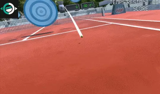
Nothing else to do but take the racket, so the player does it instinctively: we simplified at its maximum this step: you just have to squeeze your hand and you catch the racket. You can throw it, catch it again, etcaetera. You learned by drinking the bottle how to grab something and you are able to do the same to play the game. Grabbing the tennis racket launches the party. Balls start to be thrown at you, and you have to toss it back to large or small targets located on the tennis court. By touching the ball, you get points, and more points by touching the targets.
Diegetic Interface
With VR, it’s important to notice that the interface must not be in the way. It has to be part of the natural landscape, the player should not see it at first sight: it has to be diegetic. On the outer screen, the one that everyone can see without puting the helmet, you can see the score and the elapsed time in a corner of the screen. But inside the helmet, the player sees its score only on the background display unit looking exactly like a real tennis court display unit. The best score is printed on the field itself, on the ground, to not disturb the player but being present anyway, printed in white chalk like the tennis field is.
To avoid motion sickness, avoid blurry interface or issues with too small details that can not be read on the small screens located a few inches away from your eyes, designing an interface that is part of the landscape is key, and simple tests can proove you how important this is.
It’s summer time, you have to drink
Since the customer brief and the project launch, a month has passed, and it’s early June when the customer gives the go. Motivated by this project, we run deeply into it, with our usual way of deliver quickly a gameplay video to validate the experience with a first demo. Mid-June, we are ready to send the video the client, but at that exact same time, the client tells us that Korea did not agree with the sport the marketing campaign has to put up front. In France, the tennis is a well followed sport, but it’s not the case over there. Problem here: Korea is the first country that will use the marketing campaign, France will go next, mainly for an internal campaign.
Ok, but we’ve got a demo, and what about the other proposal we’ve made?
No, it’s too late: the client cancels the projects, it does not fit the schedule anymore. Ouch
At that time, we did not have a direct relationship with the client: we were a provider for a communication agency that took care of everything that is not video games related. They hire us for the interactive experiences, the video games. We have to go through them to communicate and send the bill. They only did a visual concept, so mainly the pre-sale phase for them. Despite that, they ask for a compensation for the work that was already done. That is the moment where I understand that I don’t have any clause in the contract for that particular case in projects. The customer will finally agree for an intermediate bill, representing only 10% of the overall cost, and that will be paid 4 months later.
A demo, that’s it ??
So end of June is there, we learn that the project that should have give us work for the whole summer is canceled. At that time, we are ending other clients contracts and it’s also the month where we participate to Viva Tech, the world’s rendezvous for startups and leaders to celebrate innovation, we are freaked out.
We continue to work on that project to get a complete demo usable in our brand catalog, but this project is one of the multiple things that lead to the end of Equilibre Games. I won’t details everything here as it’s only a bit of it and not the purpose of this article.
With two more weeks, the game is more polished, the experience is smooth and can be used in video games fair without any help for players, and more importantly: we remove totally the customer brand and put our in place.
Credits
- Design : Frédéric Rolland-Porché
- Développement : Guillaume Thorel
- Modélisation 3D : Stéphane Landry


